This new map of Earth will change the way you see the world and it is accurate
Can you accurately represent a round world on a flat map? This problem has inundated mapmakers for centuries. Designed almost 450 years ago, the most common world map used today is highly distorted.
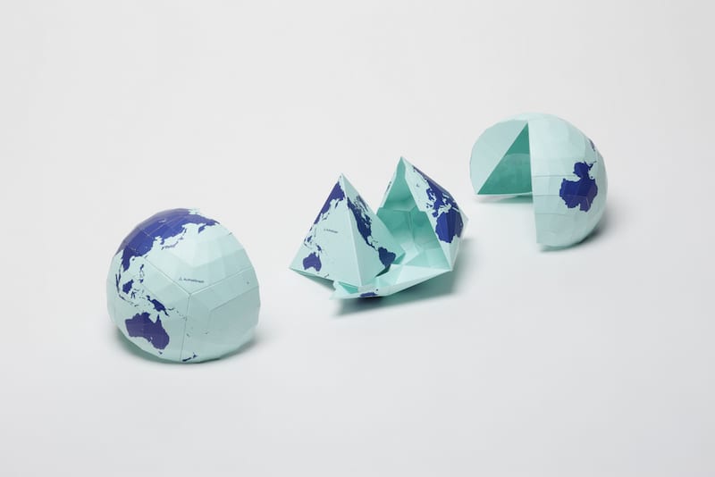
A Tokyo-based artist and architect Hajime Narukawa has created a new map named the AuthaGraphic map, which is not only scientifically accurate but also visually appealing. The well received map has just won Japan’s prestigious Good Design Award for precisely representing the relative sizes of landmasses and bodies of water on Earth. The map is so uniformly accurate including the often neglected Antarctica that you can fold it up into a three-dimensional globe.
The Mercator map – the traditional world map – is considered highly inaccurate due to huge distortions in the size of Antarctica and Greenland – caused by trying to flatten a spherical globe.
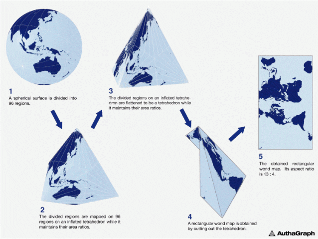
To create the perfectly proportioned map, Narukawa divided the spherical globe into 96 triangles that are flattened and transferred to a tetrahedron. This allows the world map to be “unfolded” into a rectangle while still preserving the proportions of countries.
“This original mapping method can transfer a spherical surface to a rectangular surface such as a map of the world while maintaining correctly proportions in areas,” reads the Good Design Award description. “AuthaGraph faithfully represents all oceans, continents including the neglected Antarctica. These fit within a rectangular frame with no interruptions. The map can be tessellated without visible seams. Thus the AuthaGraphic world map provides an advanced precise perspective of our planet.”
However, Narukawa’s map does have one obvious limitation: His map “doesn’t align to the cardinal directions” – that’s north, east, south and west to the rest of us, according to Popular Mechanics.
As a result, one version of Narukawa’s AuthaGraph World Map shows Antarctica below South America, and far to the right of New Zealand.
That could be at least partly rectified by selecting a different frame of the map, which would show Antarctica to south of Aotearoa.
“The map [needs] a further step to increase a number of subdivision for improving its accuracy to be officially called an area-equal map,” the Good Design Award description reads.
You can find out more by purchasing Narukawa’s cartography here.
Source: Popular Mechanics


